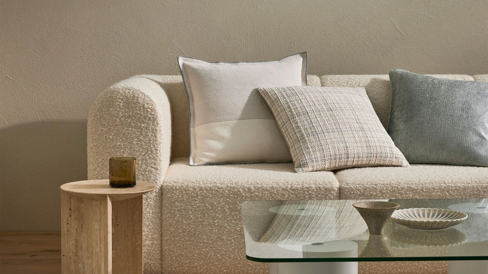
Styling with the ‘Rule of 3’ technique

“Cushions want to be in groups of at least three. Never buy two of the same cushion; it’s like buying two of the same handbag”. Megan Morton - Stylist
Style like a professional
The rule of three is a much-loved design technique used by stylists and designers across the home and fashion industries. Studies have shown that people are more visually engaged when they see a group of three items and are more likely to remember the items within the group. We are drawn to the balance of a group of three as there is something our brain finds more appealing about items arranged in odd numbers rather than even.
However, how can we use this method when creating our own interior style? There are several aspects of this ‘rule’ that we can use in our interiors to create harmony and balance.
Cushions for everyone
Cushions look fantastic in groups of three on your sofa. You can play with the size and shape for even more visual interest and dimension layering from small to large. Having a group of two cushions on one side and one on the other is also a key styling trick that draws the eye across the lounge. Stylist Megan Morton suggests: “Cushions want to be in groups of at least three. Never buy two of the same cushion; it’s like buying two of the same handbag”.
Here at Weave, we subscribe to this theory and generally we prefer to layer up cushions based on colour tone and texture rather than doubling up on the same cushion or creating a mirror image on each side of the sofa.
Arranging your artwork
When you arrange three or more pieces of artwork on a wall it becomes a collection rather than merely a single piece. This makes the grouping have more visual impact in your space and is commonly referred to as a triptych. The rule of three works very well when hanging the same or similar objects together – hanging just one basket in an arrangement would look sparse but add two more and you have a display statement for your interior.
The rule of three also allows you to tell a visual story with your art collection or explore a visual theme. Apply this rule to a grid layout as shown below with two rows of three pieces of art allowing for even more visual interest but still appearing balanced to the eye.

Image source left to right: @ayvegece and @sfgirlbybay.com
Shelving
Creating the perfect ‘shelfie’ has taken over Instagram recently. It is a great way to display your collection of treasured objects and add personality to your space. The best way to highlight these treasures is to choose items that have different shapes and sizes to construct a three-dimensional grouping.
This gives your items a sense of dimension on the shelf and invites the eye to explore further. You do not need to restrict your display to three objects you can assemble several objects together and display them in three groupings. Choosing a colour or material theme can also achieve cohesiveness in your display.

Image source: thistlekeylane.com and nataliegisborne.com.
Furniture & Lighting
Grouping larger interior pieces together in threes is a tried and tested styling trick. Not only is it visually appealing but it’s also often practical in a space too. A side table next to a chair with a lamp for example or a statement light feature over a dining table and chairs.
Laying a rug under the group of three is a way to ground the grouping together. This trick is perfect to use in an awkward area of your home that you find is not working for you. Play with variations in height and size of objects grouped and you may find a solution to your problem.
Colour and Texture
The rule of three can also be applied to colour and texture within your home. Layer tonal variations of colour to create a cohesive space as seen below with ochre sienna and blush. These tonal variations on red all play off each other to create depth and dimension on this sofa.
In a neutral space, layering different textural and patterned elements can transform potentially bland spaces into something far more interesting. As seen below with textural layering of materials: marble printed pattern and the sculptural ribbed lampshade.
The rule of three is a helpful little trick to employ around your home in all of your interior spaces from that lonely corner in your living area or a spot on your wall that needs some attention. We hope that our above suggestions can transform your interior and showcase your own personal style.


